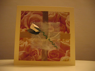
My lovely Blogger followers!

Wednesday, 26 August 2009

Raspberry Suite Color Challenge #15

Have you seen Dawn McVey's blog yet? She has a really professional and contemporary style - there isn't one card of hers that I don't like! She also has a very popular colour challenge that I've never done before but this week's one is sooo tasty I couldn't resist it...


As soon as I saw the colours I thought of ice cream! Specifically, those in an ice cream parlour my husband and I visited last year at the harbour in Auckland, New Zealand - they had melon flavour and then I thought of vanilla, pistachio, raspberry... nearly the colours of Dawn's challenge! I had my theme but I really struggled to come up with a format. Luckily, I knew I had the image I wanted to use straight away - an ice cream image from Elzybells. I just love their cute stamps! Surprisingly it took me 3 hours to come up with the design and complete the card - that's pretty quick for me! I'm never going to make any money making cards if it takes me that long to create just one! Anyhoo, here it is, what do you think?


The photo shows up the colours far brighter than reality which are pretty close to Dawn's colours. I just can't get the lighting right - must create that light box asap! Anyway, I didn't have any printed paper that matched so I used my fav Hero Arts raindrop background stamp with Versamark and cream embossing powder to give a little interest. I was also going to use my Copics to colour in the ice creams, but decided that I loved the 'linen' effect by using my colour pencils instead. To give it a little pop, I put glitter on top of the ice creams, think you might be able to see it here...


I'm really getting into these challenges and I can't wait to see what she comes up with next week! Caio for now!


Papers/cardstock: Bazzill Basics cardstock in vanilla, light olive green and raspberry (don't know actual colour)
Stamps:
Elzybells Mini Messages Summertime, Lizzie Anne Designs Sketched Sentiments
Mediums: DecoArt Glamour Dust, colour pencils (assorted brands), VersaMagic Chalk Ink in Spanish Olive
Accents: ribbons from my stash
Tools: Fiskars Apron Lace border punch

Tuesday, 25 August 2009

Sweet Sunday Sketch Challenge 32 - my very first challenge!

Well I did it! I completed my very first challenge and I chose the Sweet Sunday Sketch Challenge 32. I'm so chuffed I did it, it was a lot of fun to do! And I even managed to come up with the design AND create it within 2 hours - I normally spend days thinking about the colours before I even start it! Having someone else provide the design really sped up the process - fabulous! I used Core-dinations green cardstock and distressed it with my BasicGrey file. Anyway, here it is and I hope you like it...


I love the My Minds Eye Bloom & Grow papers - I used the paper pack and of course used my new skill with my mini sewing machine (have I told you already that I'm madly love with stitching on cards?!!). I also love that Greeting Farm owl - sink into those eyes! The photo doesn't show it but I used a silver pearlescent chalk around the owl to help it pop a bit. I used sticky pads behind the image and the die cut flower to make them pop too - again the photo doesn't show it up well. All in all, I actually like my card!

The two photographs differ quite a lot - I've been playing with the editing software to try to improve my photos, but I can't seem to get the best from it yet. I think the trick is to take a great shot in the first place. I have been researching how to take great photos and found how to make a light box so that's my next project!

Now to go and celebrate my birthday today - it's present opening time!!

Papers/cardstock: My Minds Eye - Bloom & Grow paper pack (includes the die cut flower), Core'dinations cardstock
Stamps: The Greeting Farm - Forest Friends
Mediums: Pebbles Inc pearlescent chalks, Copic Caios, colour pencils on leaves, Versafine ink in sepia
Accents: BasicGrey button, Bazzill In Stitch'z white floss
Tools: Spellbinders Nestabilities Label, Scallop and Classic Circle

Monday, 24 August 2009

Wedding card revisited & challenge dilemma!

I decided to change my friend's wedding card afterall - it was sitting there looking uncompleted but I couldn't figure out what it was that was bothering me about it! I thought about adding die cut flourshes on it, stamping the white background with a Opalite (interference ink), sticking some flocking on it - but nothing felt right. Eventually I didn't do much - just rounded the bottom corners and then decorated the inside. I didn't take a photo of it, but I also stamped the damask several times down the left hand side of the envelope. It now feels completed!


I've also been thinking about completing one of the many challenges out there, but there are so many I like that I don't know which one to choose! On my short list are:

Anyone for Anya? - Sugar & Spice and All Things Nice
Raspberry Suite - Color Challenge #15
Elzybells - waiting for challenge 26 to be announced on Thursday


Another decision to make!

Friday, 21 August 2009

I think I'm in love...

I actually went ahead and practiced using my mini sewing machine and guess what? I loved it so much I went ahead and made a card! What do you think?


I don't normally do vintage - or perhaps it's shabby chic?! - I can never get it right, but I think I did ok with this. I can't believe how easy it was to do the stitching - I scared myself silly even thinking about trying it! If you look carefully, the stitches aren't very straight in some places - those were the times I stopped concentrating on keeping the needle centred. Well I intend in using this technique a lot from now on so I'll get lots of practice!

Big thanks to Carly who left me a lovely comment on my previous entry - it was this that encouraged me to have a go today (and not leave it for another year!). You should go and have look at her creations - they are beautiful. I love the way she uses stitching and manages to keep a clean, fresh feel. Look at one of her fabulous examples here.

Mine aren't a patch on hers, but at least I can get inspiration from her when my creative juices dry up!

Papers/cardstock: K&Co Hopscotch mat pad, Bazzill cardstock
Stamps: Hampton Art Our Baby clear stamp set
Mediums: edged with brown ink

Accents: Karen Marie Klip die cut letters, velvet ribbon
Tools: sewing machine, Woodware Fingerguard trimmer with scallop blade

Sewing made easy

My mother bought me a sewing machine (Janone Mini for only £49 bought from John Lewis) a year ago for my birthday (yes, it IS my birthday around the corner!) and I only got it out of its box two days ago.


I have no idea how to sew so it's just been sitting there in its unopened box making me feel guilty every time I go into my craft room! I've now managed to get it set up thanks to a tutorial on Gina K's blog. She took away the whole mystery of using a sewing machine so a huge thanks to Gina!

If you haven't seen Gina K's blog yet, you should get over there now! She has some great tutorials and - if you're new to crafting like me - makes cardmaking seem all so easy!

So for my next challenge, I am going to make a card using stitching. I have set up the machine and ready to do some testing first!

Tuesday, 18 August 2009

Wedding card

At last! I've created the wedding card for my friend! I mulled over it for ages because I wanted it to be perfect for her. Not sure if I achieved that but I think it's a style she'll like - simple and elegant. What do you think...?


I spent ages looking at all of the gorgeous papers I've bought and got myself into a twist with the choice! I turned to my stamp collection (not those kind of stamps!) and found a Gel-a-Tins damask stamp that I haven't touched yet (and there's a lot more of those, I can tell you!). I decided to create my own background. At first I wanted to get that flock look and tried various inks to make the flock stick to it, but it just wasn't giving me the coverage I was looking for! I abandoned the idea and just inked it up with my favourite Versafine black ink. After putting it all together, I felt it was a bit flat so I used Liquid Pearls in the middle of each "flower" of the Hero Arts background stamp. Not sure if you can see it in the photo below...


So, still not sure if I love it, but I do like it. Any advice on improving it would be most welcome!


Cardstock: Bazzill Basics
Stamps: Hero Arts Dots & Flowers, Gel-a-Tins Wallpaper Series #1, sentiment from the Papermania Boutique stamp set
Mediums: Versafine Onyx Black ink, Liquid Pearls Silver Pearl
Accents: Anita's silver satin ribbon, Anita's silver organza ribbon
Tools: Fiskars Scallop Sentiment border punch

Thursday, 13 August 2009

Win a Greeting Farm stamp!

Just visited one of my favourite blogs The Greeting Farm and they are giving the opportunity to win one of their stamps! All you have to do is leave a comment on this entry Digital Creative Team Call. Get over there now!


Wednesday, 12 August 2009

Gosh - what day is it?!!

I can't believe I haven't posted anything for a few days! Don't you just hate it when work gets in the way?! Well, I guess I've already created my second card for the second week of my blog (Couldn't Resist It!), but I still do need to make a card for my special friend's wedding - it's only a couple of weeks away and I still haven't decided on the design yet!

While I stew about it, this time I wanted to share one of my creations that I really like instead of showing another one of my failures! When I first found cardmaking I got rather excited and bought a whole ton of supplies that I still haven't even touched yet (sounds familiar?!)! This was especially true for ribbons - I found a website in sale and bought a job lot without thinking what they would match with! They've sat there for over a year so I made a concerted effort to use them up. I decided to use the Miss Anya Collection stamps from The Greeting Farm as they have just enough detail to colour them in to co-ordiante with anything. I ended up making about 15 cards and it still hasn't made a huge dent in my ribbon supply! Hey ho.
Anyway, here it is...


I really like the way the colours all came together and that it show cases the image, the ribbon AND the border punch. I love those Martha Stewart punches! Anyway, hope you like the card too!
Cardstock: Doodlebug Limeade and bubble Blue, Bazzill Basics
Stamps: The Greeting Farm - Miss Anya Collection
Mediums: Copic Caios Accents: ribbon unknown!
Tools: Fiskars Apron Lace border punch

Monday, 10 August 2009

Couldn't resist it!

Some time ago I discovered The Greeting Farm and I immediately fell in love with Miss Anya and all her friends. I've got quite a collection now and use any excuse to use them. Well any excuse except for challenges! If you've been reading my other blog entries, you'll know by now that I have found it really hard to find the time to make cards, hence creating my own blog to pressure myself to develop my skills! I've wanted to play the many challenges out there, but never managed to join. Then the other day I came across a new blog called "Anyone for Anya?" with a weekly Sunday challenge - and guess what? I made a card for it - I couldn't resist it! Here's the sketch if you want to play along...


And here is my card for it...


I don't think I'm up to scratch to be a member of their design team, but I enjoyed creating the card anyway! I was quite faithful to the design even though Dawny P said we could be flexible with it. I used my Copic Caios to colour in the deer - I love shading! - and a white gel pen to add the spots on her (his?!) back. I also used some pearlescent chalk as shading - unfortunately you can't see it from the photo but it has a lovely subtle sheen. I also wanted to give the green matting a bit more interest so I distressed some Core'dinations pricked a border. I left the inside quite plain so I can add something appropriate when something appropriate turns up!! I hope you like it!


Papers/cardstock: My Minds Eye - Bloom & Grow paper pack, Core'dinations cardstock
Stamps: The Greeting Farm - Forest Friends
Mediums: Pebbles Inc pearlescent chalks, Copic Caios
Accents: none for a change!
Tools: Fiskars Apron Lace border punch, Spellbinders Nestabilities Classic Square Large

Sunday, 9 August 2009

Blog candy!

Was just browsing through my emails and got the Charmed Cards & Crafts newsletter announcing a competition to win a set of 72 Copic Ciao pens! Wow! All you have to do is submit a card with a digital download or stamped that you have coloured in. And if it's one of their own stamps or digital downloads and you get double the chance of winning (unfortunately I haven't had a chance to buy one of theirs yet - what a shame!). I just have to enter so here is my entry of a birthday card I made for my brother...


I hope I win! Thanks Charmed Cards & Crafts for the chance of winning such a fabulous prize!!

Second week, second challenge

I love looking at other people's blogs and getting inspiration from their ideas. I get all excited and think "yeah, I could do that", "that would be a great technique to try out", etc, etc and then I don't get off my backside (nearly used a stronger word there!) and just do it, finding myself getting busy with something else! What is that about?!

With this in mind and thinking about what to create this week to challenge myself, I've decided to incorporate two things. First, a very special friend of mine is getting married at the end of August so obviously a wedding card needs to be created and, second, I've decided to use somebody's sketch challenge to do this. But which one? They are all so exciting!

While I go and have a look at the choices, I thought I would share a wedding card I've created before...


Oh bleh! Another one that I'm not proud of! In the early days of my cardmaking, supplies that were most readily available to me in my local shops were paper stock, paper flowers, mulberry paper and satin and sheer ribbon. So of course I got at least one of each and used them in this card! It's not an awful card I suppose, but I hadn't even considered at the time what my personal style was - I just threw it together. That's what I don't like about it - I didn't put any any thought into what I personally like at all!

I still tend do this and I really need to stop it! Definitely something I am going to avoid for my next challenge...

Friday, 7 August 2009

Is this any better?!

It was a shame the photo I took of my card yesterday didn't do it justice so I thought I would take some more photos where there was better lighting and then to play around editing it.

Here's what I came up with...


I used Microsoft Office Picture Manager to edit it. I first used the auto correct but it just kept making it more yellow and grainy. I undid that, manually cropped it and then played with the brightness, contrast and colour. I think it's better but not a lot more! I think my options are to improve the initial lighting and get a better photo editing software. Time for some research into it!

Thursday, 6 August 2009

In the nick of time...

Well I did it - I created my first week's card for this blog as I promised myself! But it was really close - I nearly cheated by publishing a card I have in stock, but I knew I had to keep my promise to myself!
Here it is, a card for my friend's new baby girl, Zara...


I started out with a shabby chic style in my head - I even had the crochet flower, lace and pins at the ready! No matter how hard I tried, it just wasn't working out for me. I ended up making this instead with a cleaner look. I got some inspiration from a card magazine, but unfortunately I can't remember which one - sorry magazine!

The photo doesn't do it justice, even if I say so myself - lol!! I put sticky pads behind the giraffe so it pops more than the photo suggests. The colours in real life are that bit brighter too. One of these days I'm going to find out how to use my Canon digital camera to best effect - maybe then I won't feel like I've wasted my money and should have got a throw away one instead!

I even went to the trouble of decorating the inside. I love the Hampton Arts Our Baby set - the sentiments are very thoughtful in a lovely feminine font. In case you can't read the text, this one says "Sometimes it's the smallish things that take up the most room in your heart." So sweet!

In comparison to the card I showed a couple of days ago... well there is no comparison! I so much more prefer this one! The proportions are right, the embellishments co-ordinate and there's a better use of the space. What would I change? I would make the cream/pink/green rectangular matting (that the giraffe sits on) narrower, perhaps a centimetre off. I don't particularly like the hole for the eye either - I originally intended to put a mini button there but I didn't have one small enough! A small gem wasn't right against the rest of the very mat look. I do like the mat look, but a subtle sheen probably would have finished it off perfectly - Glimmer Mist on the giraffe's spots and horns comes to mind. Overall though, very happy with it (and I'm a huge perfectionist!).

Here's what I used:

Papers/cardstock: K&Co Brenda Walton Small Wonders Girl mat pad
Stamps: Hampton Art Our Baby clear stamp set
Accents: green/white gingham from stash, mini heart buttons from stash
Tools: Fiskars Apron Lace border punch, Sizzix Original Giraffe #2, Spellbinders Nestabilities Labels 1, hole punch (for giraffe spots), wavy decorative edge scissors

Tuesday, 4 August 2009

At last - a challenge, but first...

Yay! One of my very good friends who is living in Dubai for the next couple of years has just had a baby girl! She already has two little boys and - even though she adores them - really wanted a daughter this time round. I'm so pleased her wish came true! And at last I have an excuse to make my very first card for my blog! I'm already thinking about the design, but I thought it would be interesting to share a card I made for my cousin's new arrival last summer and then compare it to the new card.


I'm not sure if I like this card! It was a first attempt at putting something together using my own imagination. I think I got the colour combination right and I was sort of on the right lines, but overall it completely misses the mark! Hey ho! I think the main problem with it is proportion, specifically the tag with the heart and sentiment and the buttons too. I DO like that I attempted a vintage look, but I DON'T like that it is far too plain for the look. I don't think vintage is really my style, but then again I'm not sure what my natural style is yet!


Okay, I'm very excited about making a card for a special friend and I want it to be really special as we are so far apart from each other. And, yes, I know I only have two days left to get my very first card up on my blog (panic setting in, lol!!).

Monday, 3 August 2009

What a cheat!

I'm sharing one of my cards that I really love - the colours, the fluid shape and boy does it look professional!

For all those serious crafters out there, you'll recognise that this is from the Sultry BasicGrey card kit. I wanted to create something very special for my mother-in-law and it seemed to really impress her - result! Unfortunately I just felt like a cheat because all I did was follow the instructions!

However, I'm still pleased I bought the kit. At the time I was still struggling to create anything professional (in my eyes anyway!) and the kit really helped my confidence after I managed to produce eight beautiful cards! On reflection, I realised that had been giving myself a really hard time - I was so desperate to produce something really professional that I ended up giving myself 'creative block'! The kit made me really think about colour and composition. I now feel a lot braver and just throw things together to see what comes up - often with lovely results.
And, yes, I know I only have 3 days left to make my first card for my blog! Better get going...

Sunday, 2 August 2009

What a difference - thank goodness!

I thought I should now share a more recent card I made to give some idea of my current skill level as it's very different from the early days - thank goodness!!! This is one that I made for my father-in-law to celebrate a new arrival earlier this year - his boat! I even took the card one step further and decorated the inside as well. What do you think?


In contrast with the card I showed yesterday, I actually felt I had created it. Even though the paper came from a collection (and therefore already colour co-ordinated!), I cut out the pieces to make the boat without use of a template. Okay - so not exactly a difficult shape, but I did do it all by myself!

I can't remember off the top of my head the materials I used, but I'll find out and list them in case anyone is interested! *Speak* soon!

Saturday, 1 August 2009

First efforts!

My second day and my second posting. Today I thought I'd share one of my very first creations. I debated doing this because, quite frankly, I'm very embarassed of it! But I promised to be honest with myself and how can I improve if I can't face my mistakes and learn from them?
So here it is...


OMG - I'm so embarrassed! It was (obviously) a father's day card. My poor dad - after receiving all those carefully chosen bought cards over the years and he got this effort from me! LOL! To his credit, he didn't grimace or even laugh - love you dad! But let's face it, my 9 year old nephew could have done a lot better...
Okay, apart from the obvious - looks unprofessional and cheap - the reason why I really hate this card is because I felt like a cheat making it. I didn't own a lot of stash then and all of the pieces (including the card) were magazine freebies. I didn't actually feel like I made it myself at all - just added some glue! But I must have liked something about it at the time or I wouldn't have given it to my dad!

So what DO I like about it?! I think the colour combination is okay (even though I couldn't really go wrong because the freebies were already colour coordinated!) and I quite like the composition and balance of the elements. How could it be better? Well, any thoughts from out there would be most welcome! I think perhaps it's a bit too plain so some additional texture might have been good and it needed to 'pop' more so some added depth would have helped. I don't think I even owned any sticky foam pads then!

Well, I feel like I've laid bare one of my biggest failures today! It feels pretty good...let the therapy continue!

LinkWithin

Blog Widget by LinkWithin